Codux Help Center
Browse our articles to find the answers you need
Selecting and Interacting With Components
The stage in Codux is where you can see components rendered. You can view, edit, and interact with with your components on boards, and see how they behave in different scenarios. The default mode for the stage when you open a component is Select mode. In this mode, you can validate your components by checking their properties and seeing what styles apply to them, and make edits to selected elements accordingly.
When you want to interact with your components to see how they respond as you play with them, use Preview mode. You'll find this mode great for testing transitions. For example, see how long it takes for a button to transition from its 'default' state to its 'hover' state. Then, if you aren't satisfied with the transition time, select the element from the Elements panel (or by re-enabling Select mode) to make the necessary change to improve the user experience of your app.
Switching Between Modes
To switch between modes (Select to edit and Preview to interact with the components), use the buttons at the top right side of the stage.
You can also use the Alt V keyboard shortcut on Windows and Linux computers, and the ⌥ V shortcut on macOS to switch between modes.
Check out how easy it is to select elements on the stage and then find them in the elements tree:
Drag on Stage
Codux has a nifty feature where you can create a copy of an element right where you drop it. This feature is useful when you want to duplicate an element without having to copy and paste its code manually, or to add the same element again through the Add Elements panel.
You can use this feature to create multiple instances of the same element with different properties or behaviors. Just select an element on the stage, and drag it to a new location. A copy of the element will be created and placed on the stage. You can then edit the copy as you wish.
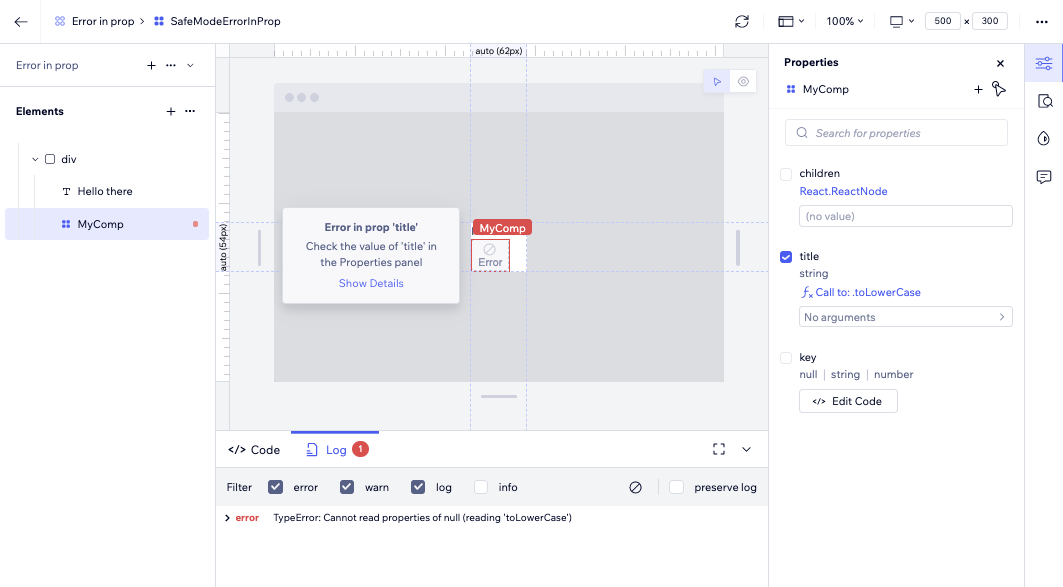
Codux Safe Render
When Codux detects runtime errors in a component's code, properties, or children (anything from undefined properties to elements that cyclically call one another), it isolates the errors and allows the rest of the component to still render in Codux. All elements of a component that can be viewed will be shown on the stage, allowing you to continue testing your components while the elements with issues get fixed.
It's important to note here that elements that Codux cannot show because of an error won't work outside Codux either, and therefore should not be ignored. It may even be that outside of Codux, you won't be able to see any of the elements in your component (even the non-problematic ones) because of the element with the error. When an element has an error, the page layout is likely to be affected both inside and outside Codux.
You'll see visual indicators and cues on the stage to help you troubleshoot the problem elements, including quick access to the relevant error logs where you'll find additional information related to the problem.
To configure the maximum number of rendered elements allowed before this feature kicks in, see here.
Was this article helpful?