Codux Help Center
Browse our articles to find the answers you need
Creating Cover Images for Boards
When you show boards with components in the Add Elements panel (done by default), Codux automatically renders a preview of the board as it looks. When you make changes to the board, the preview in the Add Elements panel refreshes to show the latest changes, so you always know what you're adding when you add the board's components to another component. We also show previews of components in our rich content packages in the Add Elements panel.
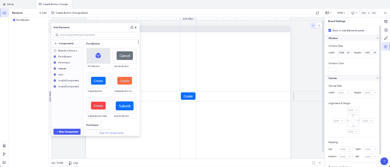
There are cases where you might want to create your own cover image to represent a board, such as the following:
- If you want the thumbnail to show something different from the rendering.
- When you create your own component library that you want to include cover images for.
To add a cover image to a board, first create an image file of the board and save it in your project's assets folder. You can do this from the stage in Codux, or by viewing your board in isolation. Then import the file like this:
1import create from './create.png';
Set the
cover property to point to the imported asset, and you're done! See lines 3 and 8 below:1 2 3 4 5 6 7 8 9 10 11import React from 'react'; import { createBoard } from '@wixc3/react-board'; import { FormButton } from '../../../components/form-button/form-button'; import create from './create.png'; export default createBoard({ name: 'Create-Button', Board: () => <FormButton variant={'secondary'} content={'Cancel'} />, isSnippet: true, cover: create });
Note:
If you've added a third party component library through
codux-external-components.json, you'll need to add each component to a board before you can create a cover image for it and add it to the Add Elements panel.Was this article helpful?