Codux Help Center
Browse our articles to find the answers you need
About the Portfolio Template
This document outlines our portfolio project - a professional interior design portfolio app built as a single page application with the help of Codux. We built this project to demonstrate how you too can build a project in Codux that's connected to a CMS. Many technologies were used to build the app, and the role of each is detailed below.
Technologies Overview
- Strapi: Used as a headless CMS to store content and serve it to the client app.
- React Router: Manages navigation between multiple routes (pages).
- Vite: Serves as the front-end development environment.
- Yarn: Used to create a monorepo and manage dependencies.
- ESLint: Helps maintain code quality by performing static analysis.
- SCSS modules: Facilitates writing scoped CSS.
- Classnames: Assists in assigning multiple classes to elements.
- Vitest: Used for writing and running unit tests.
- Faker: Generates mock content for Codux boards and unit tests.
- SWR: Handles caching content in the client app, fetching new content periodically, and providing a simple API between the content cache and React components.
- Radix-UI navigation menu: Creates an accessible site navigation menu.
- Floating UI: Positions floating elements like sub-menus, tooltips, popovers, etc.
- Framer Motion: Used for creating animations.
Getting Started
To open the portfolio project, just select it from the quick-start templates in Codux.
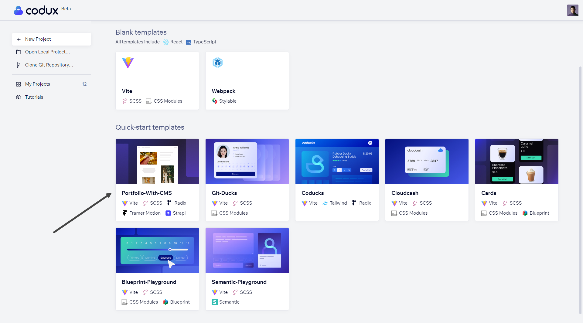
Like all of our templates, Codux will create a local copy of the project from our GitHub repository that you can modify independently. Run the installation script when the project opens to install the project's dependencies.
Once you open the project, you'll discover several boards. One of these boards, named 'App with CMS Data', is linked to Strapi, which serves as the content management system (CMS) for this application. The data displayed on this board originates from our Strapi instance.
The focus of this article will be on setting up your own local Strapi instance. Once set up, you'll be able to view your data within this instance. This will provide you with hands-on experience of managing and viewing your content with Strapi.
Important!
As per Strapi's documentation, only Active LTS or Maintenance LTS versions of Node.js are supported (currently v18 and v20). Odd-number releases of Node, known as "current" versions of Node.js, are not.
How We Built the Project
Strapi for the CMS
The process of setting up Strapi locally to use for the CMS of a project involves three steps:
- Starting the Strapi Server
- Setting Environment Variables
- Adding Strapi Content
Starting the Strapi Server
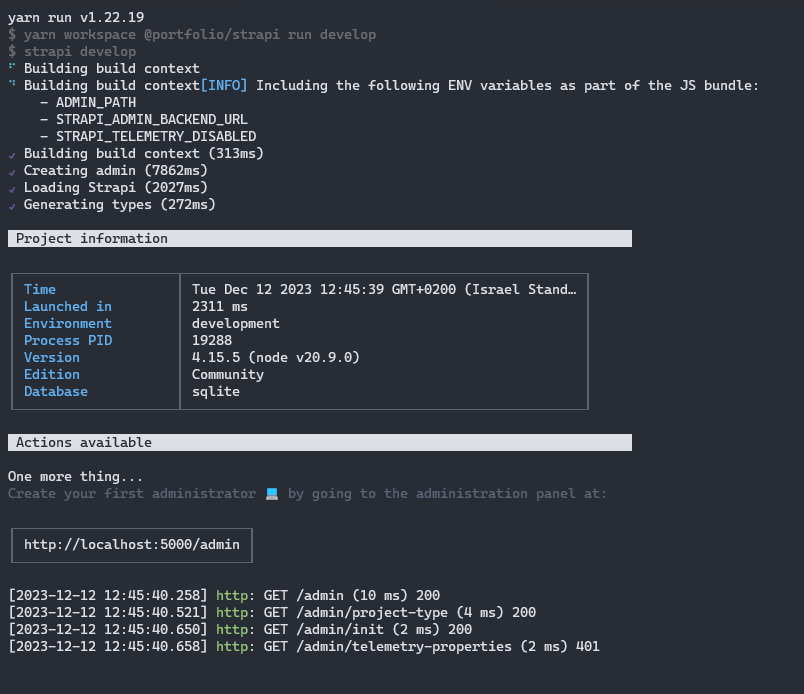
To start up your local Strapi instance, you just need to run a single Node.js script to trigger the creation of an environment configuration tailored for your local setup. Run the following command from the root of your project:
1node create-env.cjs
Customizing the server port
Running this command does several things for you:
- It creates a
.envfile in the /packages/strapi directory of the project. - It creates a
.env.development.localfile in the project's /packages/client directory (when you deploy your Strapi server, remember to change this to the appropriate domain). - It generates a random project ID in
/packages/strapi/package.json.
Now, start the server by running the following command:
1yarn start:server:dev
You should see some script output that looks like this:
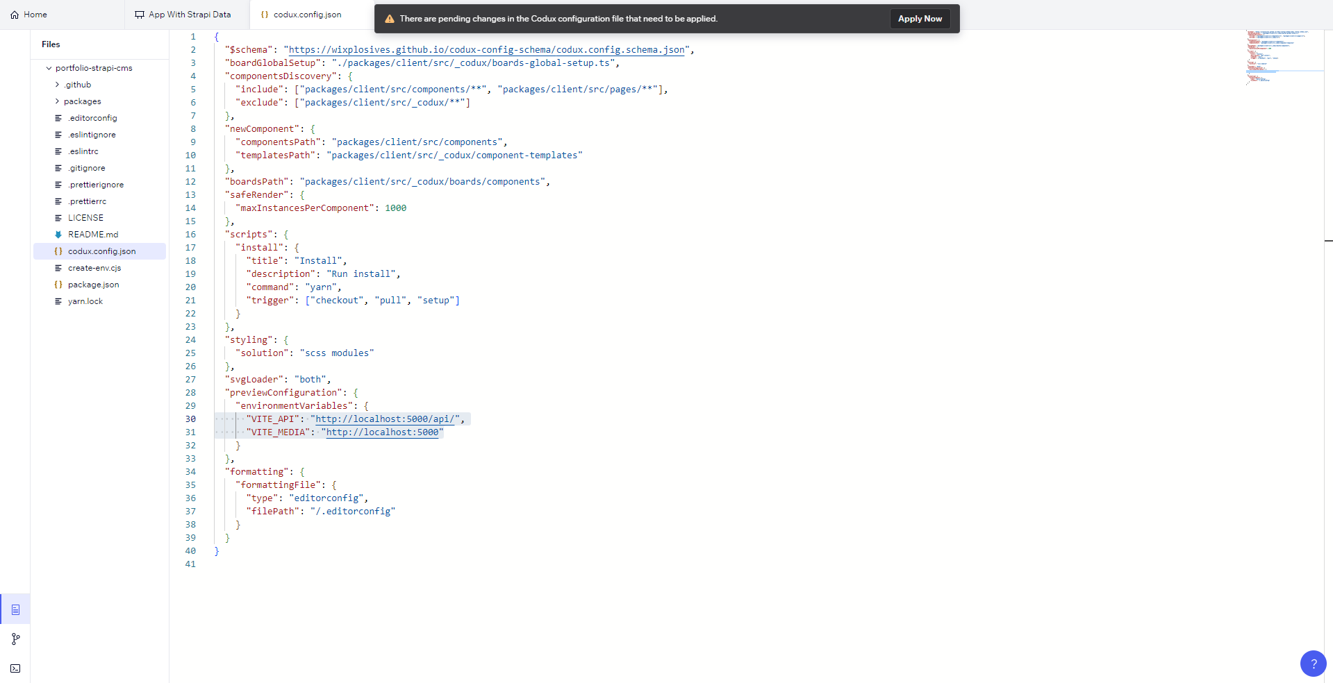
Setting Environment Variables
In applications development, environment variables play a crucial role in configuration and management. Specifically, while working with a Strapi instance in this project, these variables would define the Strapi instance that the board receives its data from.
- Open
codux.config.jsonfrom the Files tab in Codux. - Change
previewConfiguration.environmentVariables.VITE_APItohttp://localhost:5000/api/(replacing '5000' with the port you specified when/if you specified one while starting the server). - Change
previewConfiguration.environmentVariables.VITE_MEDIAtohttp://localhost:5000(again, replacing '5000' with the port you specified when/if you specified one while starting the server).
Important!
Make sure to click Apply Now after making the changes to codux.config.json.
Refer to Setting Environment Variables for Your Project for more information on this configuration key.
Adding Strapi Content
The first time that you start the local Strapi server, you should see the Strapi registration form for locally setting up your instance.
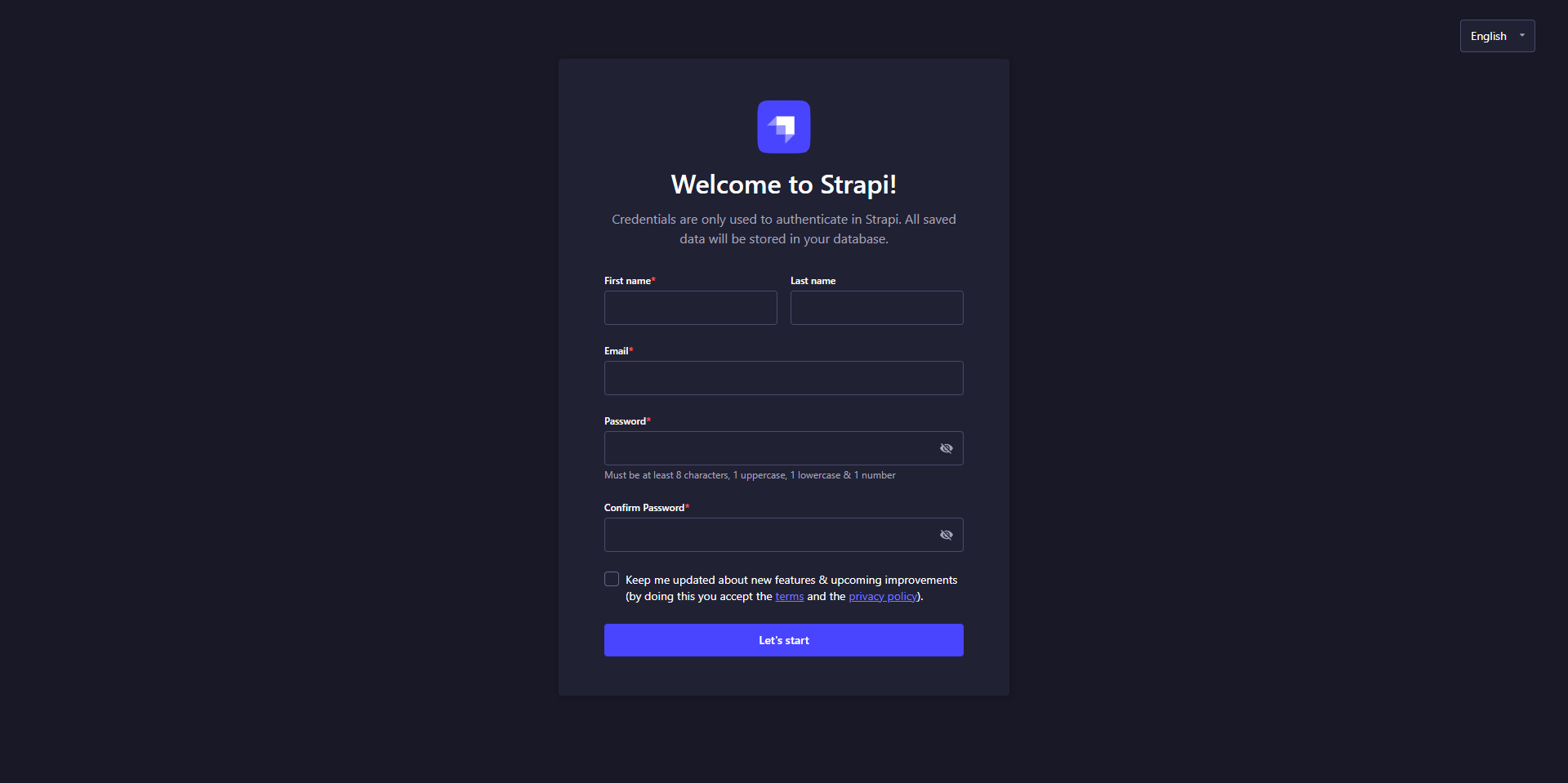
Fill out the required fields, and click the start button. Here, you'll see 3 collection types -
Project, ProjectItem, and User, and a single type - About.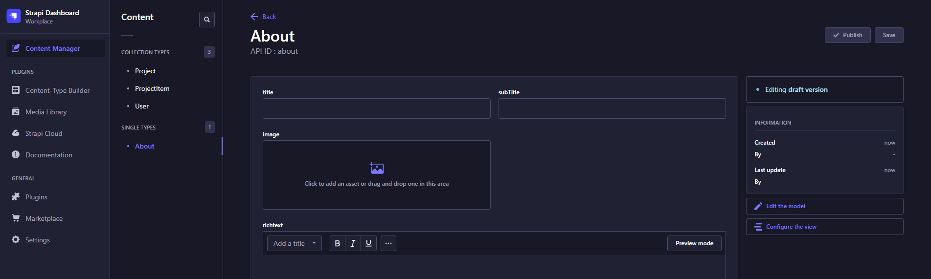
- Project: Each project you create in Strapi will show up in the App With CMS Data board under the Projects menu, and in the project navigation pane.
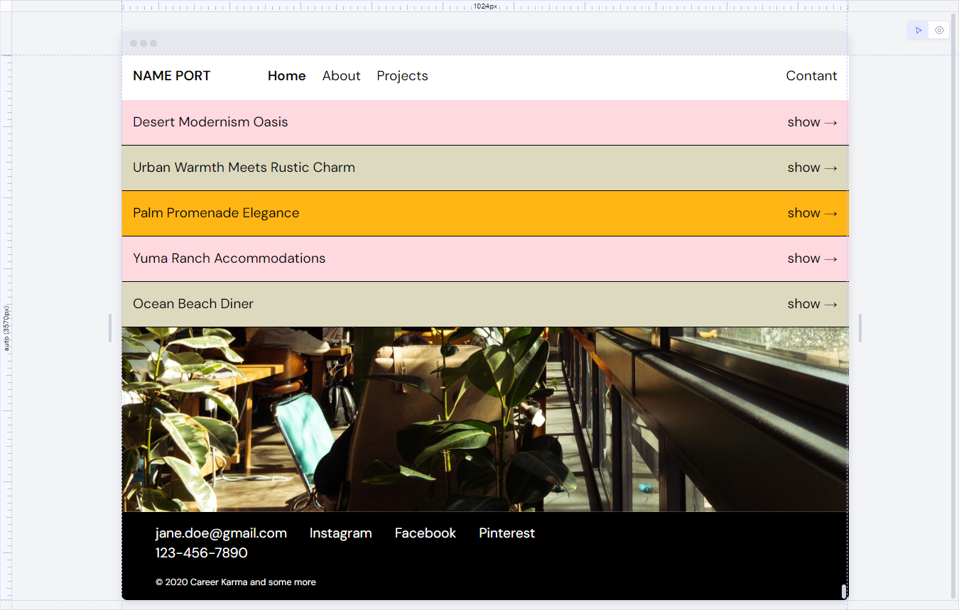
- ProjectItem: Every project contains project items to showcase the project. They each include a picture, title, and short description.
- About: The content from here appears on the About page and in the footer.
A note on mocking data
The majority of the data in boards in this project are provided with fake data from Faker. The use of Faker-generated mock data offers several advantages to a project:
- It allows for the testing of component designs without the need to input data into Strapi or any other platform.
- It removes the necessity of having a locally-running or hosted Strapi instance to work on the client application.
- It enables the creation of boards for various scenarios, such as dealing with extremely long or short text, varying numbers of items, and more.
- You can use your boards in tests.
Menus and Routing
We used Radix UI to create the navigation menu in this app, which includes the "Home", "About", "Projects", and "Contact" pages. We also used React Router to define routes for the application. Each route specifies which component should be rendered when that route is accessed. For example, the "About" route renders the AboutPage component.
Additionally, if you look in the code, you'll notice the following:
- We used the
Linkcomponent fromreact-router-domfor each menu item. - The routes are managed efficiently thanks to defined constants for each route in
config.ts. - The
useMatchhook from react-router-dom checks if the current route matches thetoprop of aLink, and If it does, an 'active' class is added to the link to highlight the currently-active menu item.
Radix UI
This library has components that anyone can use and customize. It also has headless components which provide the core functionality of the component but leave the rendering up to you.
We started by importing the necessary modules and defining our
SiteMenu component. This component fetches project data and returns a RadixMenu.Root component, which serves as the root of our menu. Inside this root, we have a RadixMenu.List that contains our main menu items: "Home", "About", "Projects", and "Contact".Note:
If you want to add more components from Radix UI, you can follow the same process. Simply add the relevant components to your package.json file and install them. You can find more information about these components and how to use them on the Radix UI website. Refer here for information on adding component libraries to Codux.
React Router
We defined a set of routes for the application, and specified which component should be rendered for each route. In
routes.tsx file, you'll see our defined routes as follows:ROUTES.projects.path: Renders theHomePagecomponent.ROUTES.project.path: Renders theProjectPagecomponent.ROUTES.about.path: Renders theAboutPagecomponent.- The
rootroute, which renders theSiteWrappercomponent and has a Navigate component that redirects to the Home route by default.
After defining the routes, we integrated this setup with our Radix UI menu with the
Link component from react-router-dom for each menu item. The to prop of the Link component was set to the corresponding route defined in our routes.tsx file, so that selecting a menu item would lead the user to the appropriate page as per the defined routes.In our
config.ts file, you'll see that we established a more efficient way to manage routes in our application by defining constants for each route:1 2 3const ABOUT = '/about'; const PROJECTS = '/projects'; const PROJECT = `${PROJECTS}/:id`;
These constants are then used to create the
ROUTES object:1 2 3 4export const ROUTES = { about: { path: ABOUT, to: () => ABOUT }, projects: { path: PROJECTS, to: () => PROJECTS }, project: { path: PROJECT, to: (projectId: number) => generatePath(PROJECT, { id: projectId.toString() }) },};
This object maps each route to its path and a function that generates a URL for that path. For routes that require parameters (like the PROJECT route), we use the
generatePath function to replace the :id parameter in the PROJECT path with a specific project ID when generating a URL.Refer here for additional information on using React Router in Codux.
Page Links in the Menu
Each menu item is rendered using a
MenuItem component. This component uses the Link component from react-router-dom to create navigation links. It takes a to prop, which is the path you want to navigate to when the link is clicked.The
useMatch hook from react-router-dom is used to check if the current route matches the to prop. If it does, an active class is added to the link, highlighting the currently active menu item.Here's a simplified example that accomplishes something similar:
import { Link, useMatch } from 'react-router-dom';
1 2 3 4 5 6 7const MenuItem = ({ to, children }) => { const match = useMatch(to); return ( <Link to={to} className={match ? 'active' : ''}> {children} </Link> );};
The Projects Menu
The Projects menu item is different from the others in that it has a submenu that lists all the projects. This submenu appears as a floating element when the Projects item is hovered over. We achieved this by wrapping the submenu content using our
FloatingContentWithTrigger component. This component uses the useFloating hook from @floating-ui/react-dom to handle the positioning of the floating element. The submenu content is then portalled to the body of the document using createPortal to avoid any z-index issues.We dynamically created routes based on the fetched projects data. For each project, a
MenuItem is created with a to prop that's a function of the project's id.Framer Motion for Marquee Banner
Framer Motion is a powerful library for React that allows developers to create complex animations with ease. It provides a simple, declarative syntax, which makes the codebase easier to read and maintain.
In our project, we used Framer Motion for several animations and scroll effects, including the marquee banner on the home page which moves from right to left in a continuous loop.
Here's a snippet of how we implemented it:
1 2 3 4 5 6 7 8 9 10 11 12 13 14 15 16 17const marqueeVariants = { animate: { x: [0, -1000], transition: { x: { repeat: Infinity, duration: 8, ease: 'linear', }, }, },}; return ( <div className={styles.marquee}> <motion.div className={styles.marqueeContent} variants={marqueeVariants} animate="animate"> {Array(2).fill('Desert Oasis • Urban Charm • Palm Elegance • Ranch Comfort • Beachside Dining • ')} </motion.div> </div>);
In this code,
marqueeVariants is an object that defines the animation for the marquee banner. The x property in the animate variant represents the horizontal position of the banner, and it transitions from 0 to -1000 over a duration of 8 seconds. The repeat: Infinity property ensures that the animation loops infinitely. The motion.div component is then rendered with its variants prop set to marqueeVariants and its animate prop set to "animate", creating the desired animation effect.Was this article helpful?